Google has changed the rules of the game. With mobile-first indexing now the default, your site’s mobile version decides how you rank. Over the past decade, mobile devices have become the primary way users search, browse, and shop online. This shift has made SEO for mobile essential. To deliver seamless user experiences, Google now evaluates mobile usability, page speed optimization, and responsive web design before ranking websites in search results.

If you are running a business or optimizing a local website, you need to understand what mobile-first indexing is. For example, when you optimize your site, think of SEO for mobile as the foundation. Search engines now measure mobile usability first, meaning that ranking well depends on how effectively your site performs on smaller screens.
In this article, you will learn about what Mobile-First Indexing is, along with the things involved in it. These things will help you understand mobile-first indexing clearly and strategize your SEO campaign effectively.
Also Read:
- How to Use Internal Site Search to Discover Content Ideas
- Mastering Voice Search Optimization: A Comprehensive Guide
- Redefining Wealth Creation: How Jarsy Opens the Pre-IPO Market to Everyone
What Does Mobile-First Indexing Actually Mean?
Mobile-first indexing implies that Google will first use the mobile version of your website for ranking and indexing. Previously, Google used to crawl the desktop version of your site first. However, that doesn’t show how users browse the web anymore.
Now, whenever Google visits your website, it will first look at how your mobile pages are structured, how quickly they load, and how usable they are on smaller screens.
However, it doesn’t mean that there is a separate “mobile index” mode. Instead, your site will still be indexed as a whole. But the mobile version of your content will also be treated as the main version.
If your website’s mobile version is incomplete, stripped down, or poorly designed, your overall search performance will suffer, thus lowering your rankings.
Why Google Changed Its Algorithm?
The reason why Google did so is very simple: most users are using mobile phones now. Search engine data shows that more than half of all web traffic comes from smartphones and tablets.
If search engines want to serve relevant and high-quality results, they need to make sure that those results are optimized for the devices used by people to see. With mobile-first indexing, search engines make sure that users get a smooth user experience when they click on a result, whether they are using a phone on the go or a desktop at work.
Why is Mobile-Indexing Important for Your Website?
Here are the reasons that make mobile indexing important for your website:
Impact on SEO and Rankings:
Strong SEO for mobile ensures your site meets modern ranking factors. Google rewards mobile-friendly layouts, fast loading times, and accessible content, making this a critical part of every digital strategy. If your mobile site is slow, cluttered, or incomplete, it can hurt your rankings even if your website looks flawless.
Sites that ignore mobile usability often witness higher bounce rates, shorter visit durations, and lower engagement. All these signals can directly impact your SEO in a negative way.
At the same time, a fast, clean, and mobile-friendly website can build trust with users, reduce bounce rates, and signal to Google that your site is valuable and relevant.
Influence on User Behaviour and Conversions:
Think about how frequently you use your phone to search for something nearby, check reviews, or make quick purchases. If you land on a site that is hard to read or navigate on your phone, you will definitely jump to another one.
This is where mobile-first indexing works directly with business outcomes. A mobile-friendly site not only helps with visibility but also boosts conversion rates. When people find it easy to scroll, tap, and load your pages, they are more likely to stay longer and engage with your content or services.
Tips to Prepare Your Site for Mobile-First Indexing?
Here’s what you need to do to ensure your site is mobile-indexed properly:
1️⃣ Ensure Proper Alignment of Content on Mobile and Desktop:
One of the biggest mistakes made by site owners is offering a stripped-down version of their site on mobile phones. While a simple layout might be fine, the actual content should always remain the same.
Google needs the same text, headings, structured data, and metadata on both versions. If the mobile version is missing sections or features, Google might assume that your site has less content and rank it lower.
Actionable Tip: Audit your mobile site to ensure that all important content is present, including product descriptions, blog posts, and meta tags. Avoid hiding important information behind tabs or expandable sections that might not be easy to crawl.
2️⃣ Optimize Page Speed and Core Web Vitals:
Mobile users expect instant results. This is why page speed optimization is critical. It ensures mobile visitors experience fast-loading content, improving both engagement and SEO rankings
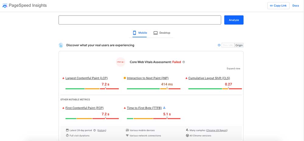
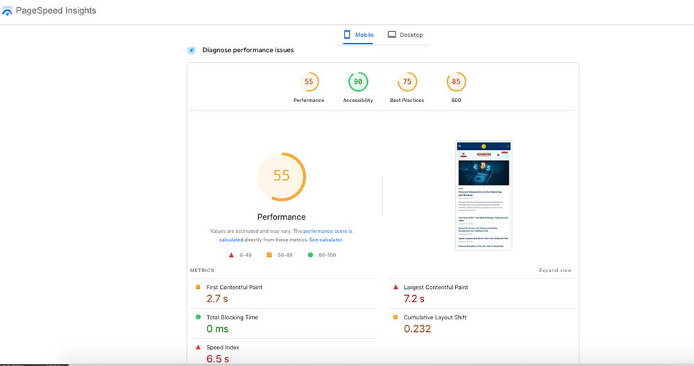
Test your site’s performance with Google PageSpeed Insights and optimize Core Web Vitals for better SEO. Google measures performance using Core Web Vitals, which analyzes metrics like loading time, interactivity, and layout stability. These vitals will directly influence the way your site performs in search results.
Pro Tip: These are standard page speed optimization practices—compressing images, enabling caching, trimming scripts, and using a CDN all directly improve mobile performance. It is also important to run your site through Google PageSpeed Insights to get detailed recommendations on improving load times for mobile.
3️⃣ Implement Responsive Web Design:
With responsive design, you can ensure that your site automatically adapts to any screen size. Instead of having separate mobile or desktop sites, responsive design will allow you to maintain one version that works everywhere.
As a matter of fact, it is the most Google-Friendly approach that lowers the risk of missing content or creating inconsistent experiences.
Pro-Tip: If your site is still using a separate m-dot(mobile) version of your website, you should consider shifting to a responsive framework. This will help you maintain your website in a simple way and ensure consistent crawling.
Common Issues That Impact Mobile-First Indexing
Some of the common issues that can impact mobile-first indexing include:
1️⃣ Unplayable Media or Poor Formatting:
Sometimes, elements like videos, animations, or pop-ups work fine on desktop but can break on mobile. This will result in broken layouts, overlapping text, or media that won’t load.
The best way to deal with such an issue is to test your pages on multiple devices and screen sizes. Use mobile-friendly video formats like MP4 and avoid autoplay features that will drain mobile internet data and disrupt the user experience.

2️⃣ Blocked Resources:
If your Robots.txt file blocks critical resources like CSS or JavaScript, Google might not see your mobile layout correctly. That can result in indexing problems or lower rankings.
To deal with such issues, you should make sure that all important files are crawlable. You can use the URL inspection tool in Google Search Console to check what Googlebot sees on your mobile pages.
3️⃣ Intrusive Interstitials:
Large pop-ups or banners that cover the screen on mobile devices can leave users frustrated. They are also considered a negative ranking signal. They prevent visitors from accessing content quickly.
The best solution to deal with this situation is to keep the pop-ups small and easy to dismiss if you use them. You should also make sure that they don’t cover the main content when the page loads.
Also Read:
- Content Readability & SEO: How Optimization Tools Help
- Boost Your Blog’s Readability: Must-Have Tools For Bloggers
- From Arts to Commerce: How AI in Education Shapes Every Student’s Future
To Summarize
Mobile-first indexing reflects how people actually use the internet today. Instead of treating mobile optimization as an afterthought, it has become the starting point.
Ultimately, SEO for mobile is not optional. It connects usability with visibility, helping businesses capture on-the-go audiences and maintain competitiveness in a mobile-first world. It will help you ensure you rank on search engines and have higher conversion rates. Including page speed optimization as a regular part of site audits will help you stay ahead of Google’s updates and deliver a smoother user experience
✍️ Guest Write with Us
At TrendVisionz, the digital venture of Nuteq Entertainment Pvt Ltd, we welcome contributors who share our passion for storytelling, digital marketing, and innovation. Whether it’s an article, case study, or industry insight that educates, inspires, or entertains — we’d love to feature your perspective.
- Explore our work: Nuteq Entertainment | TrendVisionz | Author Profile
- Read our newsletters: Transforming Lives | BizTech Chronicle | Nuteq Newsline
- Guest Contributions: BizCatalyst360 | Praja Today
- Books: Go Mindfulness: Practices for Professionals Coached
- Join the community: LinkedIn Group – Digital Marketing & Content Creation World
- Connect with me: LinkedIn | Twitter | #StoryforBusiness
- Share your review: Leave your review on Google — your feedback helps us grow.
Follow me on Twitter or LinkedIn. Check out our website.
How to Contribute:
Send your pitch or draft to Editor: anujmahajan@trendvisionz.com